 Back
Back


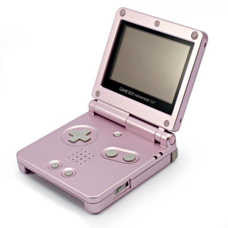
Game Boy Advance SP
This is my favorite video game console. The Game Boy Advance SP was released in 2003, two years after the original Game Boy Advance model. It removed the headphone port, but it also added three major benefits: it's rechargable, it has a lit screen, and it has a beautiful clam shell design.
I didn't grow up with the console. My older brother had one, and I used it sometimes, I guess, but I mostly used my DS Lite to play GBA games instead.
The simplicity of the system is so attractive to me. This goes with a lot of older technology, so why the GBA SP in particular? For me, it would have to be the clam shell design. There's nothing more satisfying than closing the system and hearing that pop! Beautiful. It also protects the screen and makes it more portable. The clickiness of the power switch makes turning it on satisfying, the click of a Game Boy Advance cartridge into its slot makes putting one in satisfying, and when a cartridge is inserted, it is flush to the rest of the console to make it into a perfect shape.
I do like the Game Boy Advance original as well, but not as much as this beautiful system.
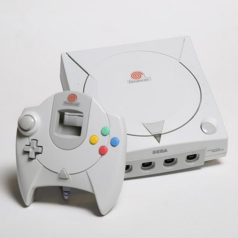
Sega Dreamcast
Once again, I did not grow up with the Dreamcast. It was released in North America in 1999. In fact, I never knew a thing about it until less than a month ago. (This is being written on May 4, 2022.) And I had never seen one in real life before until last week. So why do I have an affection for it?
For one thing, I like to think that I'm not greatly affected by nostalgia. I don't simply prefer the things I experienced when I was a kid. I like the Dreamcast more than other consoles because of that.
But let's get into the actual reasons.
1. Aesthetic. The Sega consoles that preceded the Dreamcast were black. I wasn't around at the time, but it seems to me that they were trying to be the edgier side of gaming, opposed to Nintendo. The Dreamcast sort of subverts that, I think. They made the color off-white instead of black, and it has a more relaxed vibe to me. A lot of that comes from theeeeee . . .
2. Startup screen! The Dreamcast has my favorite startup screen for anything ever. It's like you're in a hot spring, and you stand, and the water falls off your body and into the spring. That's what it sounds like. And the way the logo forms is so smooth and nice. It instantly sets the system apart in terms of the vibe you get from using it. It's just gorgeous.
3. Menu. Also contributing to the nice aesthetic is the menu screens. The background is this really lovely light blue, like you're in the clouds in the sky or underwater. Very relaxing. The icons are so cute. For the play button, you have the Dreamcast controller, and for the file manager, you have the VMU. It's very simple but those make it custom to the console and they make the menu unique. Then you have the music notes (yes, notes. It's two eighth notes.) for the CD player and the clock for the settings.
All of these icons on their own are cute, but what makes them absolutely adorable is their animations when you hover over them. It gives them personality and is much more interesting to look at than colorless, unmoving, generic icons. Also, the back button is an arrow made out of the Dreamcast logo, which is also cute and unique.
And then there are the sound effects. This is just personal taste but like, I love them. They're satisfying to listen to. I don't know how to explain it.
The menu's layout itself is simple. It's not like the recent Xbox and Playstation designs that have a million little things to choose from and shit everywhere. I'm not saying that's inherently bad, because as time has gone on, technology has gotten more complicated, so it makes sense that a larger menu would be preferable. However, I find simpler designs in technology much, much more charming. The Dreamcast's menu is nice to look at, unique, memorable, colorful, and full of personality.
4. Controller. This is not my favorite controller, but the design is just so interesting. My favorite part is the colorful buttons. That adds a lot to the appeal, in my opinion. I find it clever how it matches the design for the console, with the circular middle section and the triangle button at the bottom. But of course, the main point of interest related to this topic is-
5. The VMU. This was released over twenty years ago and my mind was continuously blown while learning about it. I won't cover every single thing here, but I'll try to cover all the stuff that I think is cool.
First of all, it's a memory card that goes into the controller, which was already weird to me. And it has a screen. Huh. So it can display things on the controller screen while you play on your television screen. That's awesome. In some cases, it actually matters for the game you're playing and gives you information. In others, it doesn't, but hey, I still think it's awesome anyway.
And then I learned that you can detach it and use it as its own portable video game console. How sick is that?! You unlock minigames from certain games you play and, once again, they can actually affect the main game you're playing. It has its own buttons and everything. Not only that, it has its own clock and file manager. And not only that, but you can transfer files over VMUs by connecting them to each other. Not only that, it has multiplayer minigames too.
So, that's most of why I like the Dreamcast. Unfortunately, most of the game library isn't what I prefer playing, but I'd love to own a Dreamcast of my own regardless.
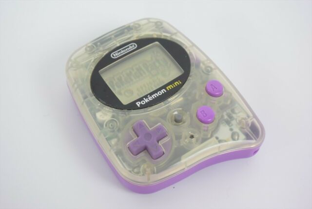
Pokémon Mini
What the fuck is this thing, you might ask? The answer is: this is the tiniest, cutest little game console in existence.
The Pokémon Mini is a portable video game console released in 2001, shortly after the Game Boy Advance. Yes, it was released in Japan, North America, and Europe. It may not look like it, but it actually uses its own video game cartridges, which are also so tiny and cute.
While not as amazing as the Dreamcast's, the Pokémon Mini's startup screen is really charming and cute! Only ten games were ever released for the console, and out of those, only four were released in North America. Obviously, it didn't sell a bunch.
A game called Pokémon Party Mini was included with the system, and it has a bunch of cute minigames, as well as a clock. I won't go through all of the games here. Some are better than others. Overall, they are very simple, but seem fun. Features of the system include multiplayer gameplay, a sort of rumble function, and it can detect when the console is being shook up and down. Pretty awesome!
I found out about this system only recently. I'm a big Pokémon fan, so that should tell you how obscure it is. I'd love to have one. Too rare though.
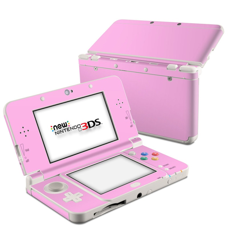
New Nintendo 3DS XL
All right, this is one I actually did use growing up! Well, not the new 3DS, but the original 3DS. I got two of them on Christmas 2011. I definitely prefer the newer one, and the bigger one. That is the one I own and use now, so I will talk in reference to that.
Firstly, again, I love the clam shell design. Satisfying to click open, satsifying to pop closed.
I think most of the reason I like the system so much is because of its menu. Like the Dreamcast, the menu is simple. Everything is laid out on the screen. In the top left, you've got the home menu settings, from which you can access themes, brightness, and other stuff I never use. Then in the top row there are all the uhhhh top row things. Notes, friend list, news, internet browser, and Miiverse.
The notes function was good, but I wish they gave you more space. They only give you 16 small screens to draw on. The friend list has sort of a weird layout, but it's fine. I like the notifications. A simple list without tons of flashy pictures and stuff. To the point, although it seldom gave me anything I cared about. The internet browser, while total trash, was my way into the internet for a large portion of my life, and I am very grateful it was there. Miiverse . . . we don't talk about that.
In the top right, you get to change the number of rows in your grid. It's simple, but this small function gives you a massive amount of control over how you want your menu to look, which just rules. Some people like it at a singular row, some want it to be as zoomed out as possible, some like it somewhere in between.
The main part of the menu itself is great too, no matter how many rows it has. My favorite is when you hover over something, it will play its own customized noise and animation! Again, it's simple, but it gives each application and game its own personality, and that's cute. Also, you can make most things go spinny if you activate the microphone!!! You can also make folders, which helps to organize your different applications, and it can also hide the things that don't fit into the aesthetic of your menu.
Themes themselves are great. Unfortunately, there were only a few that I know of that you could get for free, but the system does at least come with colors you can change your menu to, unlike the Switch. ,,,,Even though the options are still limited. There were also badges, which I never messed with.
However, it's easy to modify your 3DS and get themes and games and stuff for free! It's really cool. If you have a 3DS and you haven't modded it, look into it. It's worth it just to get yourself some cute themes. It's very easy.
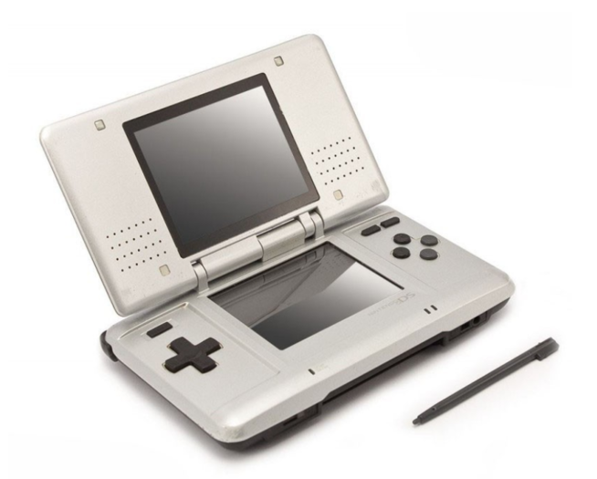
Nintendo DS (yes, the old one, not the lite)
I grew up with the DS Lite. That was the first system I owned, and I used a few of those for many years. I didn't know there was an older version that came out earlier for a long time. In fact, I think that still the only time I've seen one in person is from one of my step siblings' old boxes or something. I vaguely remember pulling it out and being like. What the fuck is this thing?
So why am I putting this version here and not the DS Lite? Because I like this one's design better. That's it. The bigger, blockier look of it is more appealing to me. The Lite may look more sleek, but I just feel as if the thicker system would feel nicer in my hands. The Lites often had this glossy look that I tend to dislike. The original generally looks more metallic I think, Idk.
Yes, once again, the clam shell design! They carried it on from the GBA SP and it became the norm for future handheld consoles. (Until they got to the 2DS. What the fuck is that.) The Lite has this design, but it's nowhere near as satisfying to close as the 3DS or the GBA SP. I think it's because of the much smaller top half. And because there are no rubber pads to act as a buffer between the two halves. I know this makes sense to me. It may not to you.
I also like how it has a power button instead of this weird switch thing on the Lite that you have to push upward. I like clicking things.
The DS also introduced the stylus concept because of its touch screen. I love using the stylus. That's cool.
Again, I don't have this system, but I would love to get one.
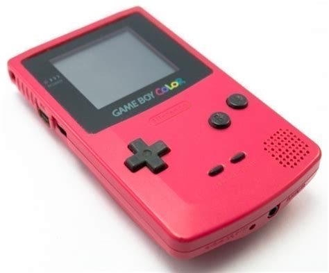
Game Boy Color
I've never even touched one of these. I like the original Game Boy, but this one is just better. It has pretty colors! On its screen and on the console. I much prefer the matte colors over the glossier ones that seem to be prevalent among Nintendo's later handhelds.
Simple console, colorful, cute. Not much else to say. There's something about the aesthetic of this one that I like a lot. Oh oh oh!! And I like the cartridges too! I'm a big fan of cartridges in general, and the GB and GBC's are really nice.
When I was younger, I saw my brother with a Game Boy Advance, and I literally thought that it was a Game Boy Color. I wasn't aware there were two different models (well, three, but ew) for the Game Boy Advance, so I assumed it was the one that came before.
And of course, I don't have one, but I would love to.